
In order to properly position and promote your film, you need very good, professional-looking art work for your poster and screener cover, and later this poster art can be used for your home video cover, sales on your website, catalog sheets, and other materials.
Having good art will help your film stand out, convey what it is about, and show you have a good film, since you have taken the care to make it good. Also, whether you pay to have a professional design your art or have some who’s very good with graphics on your team, good art conveys the high value placed on the film, which is important when a distributor seeks to sell it. By contrast, if you have amateurishly looking art, that will detract from your film, no matter how well-done, by making your film look like an amateur effort, since the value of the art transfers to the perception of the quality of your film. Consider this art like a book or music album cover which helps sell the book or album.
If you don’t have a top-notch graphics designer on your team and can afford it, hire a top professional. Figure the cost will be about $1000-3000. You might find some good contacts in your area through a local Chamber of Commerce directory or a business mixer. Other possibilities include business referral and networking groups, such as BNI (Business Networking International), which has chapters all over the U.S. in major cities. If you have a limited budget, to keep your costs down you might find someone through a local college or art school. Just contact the school’s placement center or ask an instructor teaching a class on graphics design to tell the class about your job opportunity. You might also have some success posting a notice for a designer on Craigslist or going to one of the freelance websites that feature work by freelancers who work at a lower rate, largely because they are located outside the U.S., such as www.guru.com or www.elance.com. Years ago I hired someone through Elance from Australia, and I hired some students from San Francisco State for some art projects.
To choose someone with the kind of style you like, look at the prospective designer’s portfolio – either through a personal meeting or online. To help determine the look and feel of your film, look at some covers and posters for other successful films in your genre to see the approach used. For instance, if it’s a horror film, you will probably want dark, somber tones that convey mystery and danger. You may want to incorporate images of ghosts, injuries, weapons, or other sorts of destruction and fear are conveyed in your film. As an example, if your film takes place in a haunted house and nearby cemetery, where many characters are attacked or die, incorporate images of the house and gravestones, along with people falling down and perhaps bleeding onto the cellar steps or graves. Alternatively, if your film is a romantic comedy, use light colorful graphics to convey that this is a happy, humorous film, and perhaps feature the romantic couple having fun together. For more specific guidelines, go to a store that rents or sells videos or look online where these videos are on sale to see the posters or covers. While the big video stores are gone, many videos are available at your local supermarket, drug stores, or other venues.
Once you have chosen your graphics artist or have narrowed down your search to a few artists, start with some sketches to illustrate the concept or concepts you are considering for the final art. It can also be helpful to get some feedback or suggestions from others on how they see the film’s poster and cover. In some cases, you might use a preliminary poster that you previously used in pitching the film to interest cast and crew to participate, and that can be a starting point for your final poster and cover.
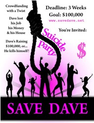
For instance, in the case of SUICIDE PARTY: SAVE DAVE, the director was also a skilled graphics designer, who had previously created posters and screen covers for over a half-dozen previously distributed films. So he already knew how to create a powerful image to present the film. Initially, he created a light-hearted but quickly drawn poster to show the film was a comedy drama, though a little dark in light of the words “suicide party” in the title. But this initial design was not intended to be the final poster or cover art.
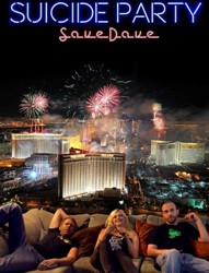
Later, after the trailer for the film was completed and he was working on the final art, he wanted to have a strong image conveying the excitement of Las Vegas in the video, since the city played a central role in the film. Also, he wanted to include a photo of the three main characters enjoying themselves there, as the primary lead Dave sought to raise money for the party, while his best friend Steve, filmed the action for a crowdfunding campaign being run by his wacky friend Gidget. But he was open to other suggestions.
Though I proposed creating a composite image of the three main characters in the desert looking at Las Vegas as a symbol of hope in contrast to the desolation of the desert, where Dave is contemplating his future and plans for the fundraising campaign, ultimately that concept wouldn’t work, since during filming, there were no shots of the three lead characters together. So ultimately the image became a mash-up of the three lounging on a couch, with the fireworks lighting up the night skies of Vegas behind them.
Besides the title for the film, include the names of the lead actors on the poster art, and you might additionally include a short catchy line, sometimes called a “tag line” or “slogan”, which sums up what the film is about, if it adds to the image. Alternatively, whether you use this tag line on the poster or not, you can readily use it on the back cover of the screener box or in your promotional copy, such as my suggested line for SUICIDE PARTY: SAVE DAVE: “If all seems lost, would a suicide party help?”
Before you finalize the art and any slogan or tag line, it’s a good idea to test it out not only with some cast and crew members, but with others who are following the progress of the film. For instance, the SUICIDE PARTY director posted two possibilities of a final cover — one with the fireworks over Vegas, the other with Vegas coming alive at night — on Facebook and asked people to share their comments and preferences. The result? The fireworks over Vegas image was the clear winner, so that’s the image he decided to use, though as of this writing, the tag line and whether to use it on the cover is still being tested.
Once you have this final art selected, use it for the poster, screener box cover, postcards, press kit cover, website, and anything else with graphics for the film, since this image will become like a brand for your film. Having great art helps to not only show it’s a great film, but you reinforce the film’s image in the mind of potential distributors, buyers, the press, and the public, and show it’s an exciting, professionally done film, thereby furthering the odds that people will want to promote, sell, and see it.
*************
Gini Graham Scott, PhD, is the author of over 50 books with major publishers, including two on films: HOW TO WRITE, PRODUCE, AND DIRECT A LOW-BUDGET SHORT FILM and FINDING FUNDS FOR YOUR FILM OR TV PROJECT. She has written and produced over 50 short films, has written 15 feature scripts, and has one feature she wrote and executive produced to be released in February 2015. She also writes scripts for clients, is Creative Director for Publishers Agents & Films (www.publishersagentsandfilms.com), and has several book and film industry Meetup groups which discuss members’ books and films and help them get published or produced.